Site changes
29 December 2013
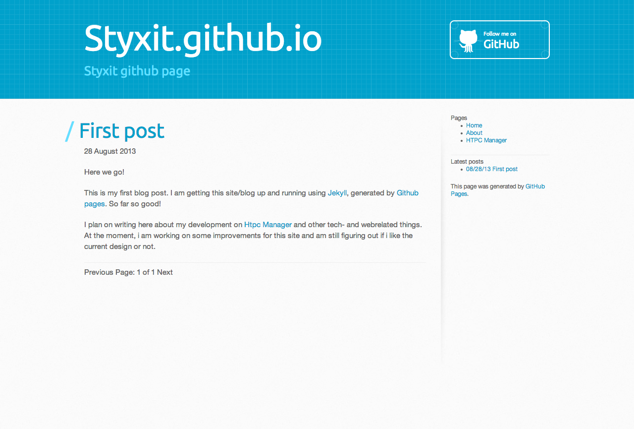
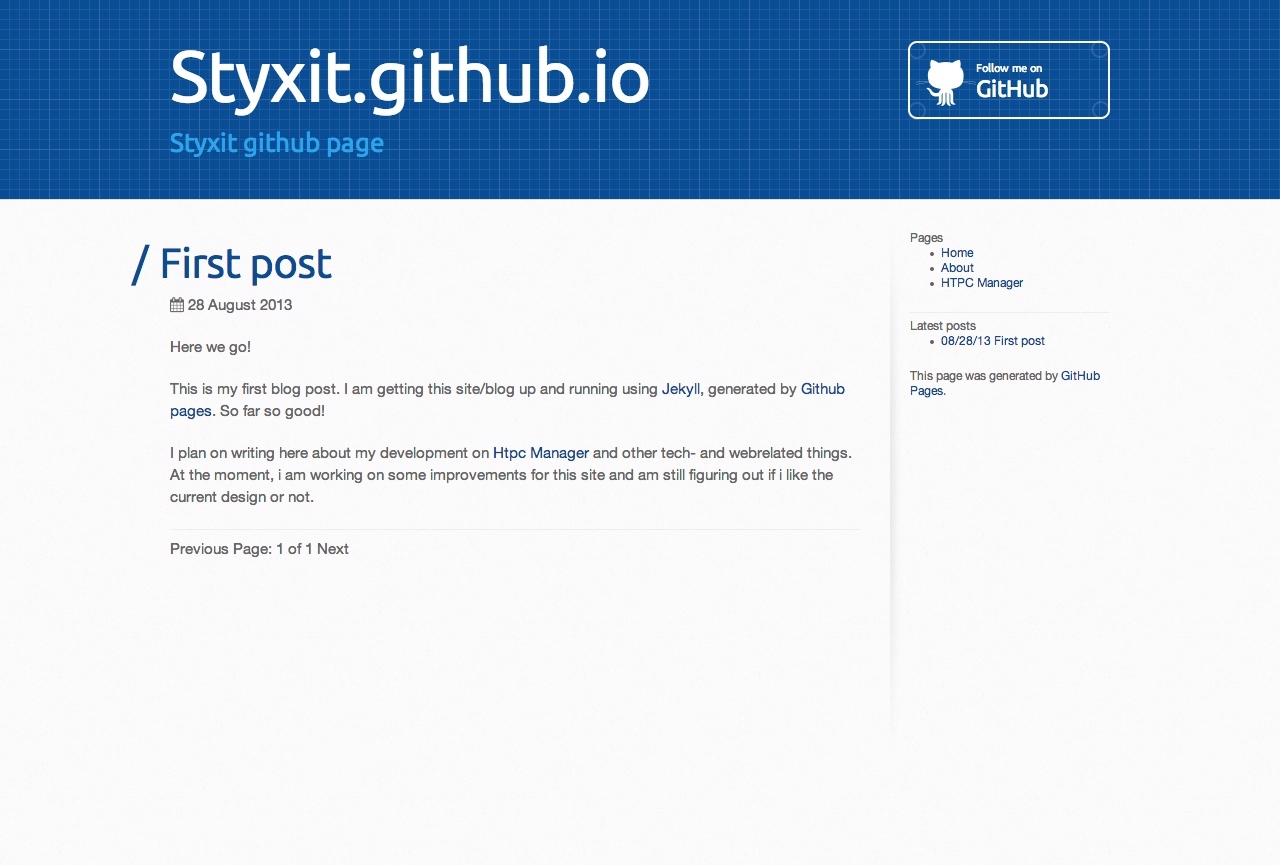
As mentioned in my first post, i had some second thoughts about the color scheme used for this blog. It turns out i am not satisfied with it. The turquoise color i used before just didn’t do the trick for me. I wanted a bright color that was an eye-catcher but not too much distracting and still have a ‘mature’ feeling.
Inspired by the Cerulean bootswatch theme inversed navbar, the new color turned out to be #094e95. I always liked the inversed Navbar in the Cerulean theme but had never used it. I considered using it for my HTPC-Manager project, but never did.
Also i found a way to truncate the post content on the index page so i can use a ‘read more’ link.
Color changes
The changes needed to accomplish this where minimal. Only three css colors had to be changed. When setting-up this site i already knew i might wanted to change to colors in the future, so i used Css colors everywhere in stead of colors in the actual header image, as it was originally. Since the source for this site is available on Github, You can see the changes i made to achieve the color-change in commit @ce1da57.
The previous layout

The updated layout
 I also included an image for the new layout, because maybe i already updated the layout (again) by the time you are reading this.
Read more links
Today i was looking for a way to use a “read more” function on the index page. Some posts can get pretty lage and i do not like an index on wich you need to scroll for ages untill you reach the last article.
I found this article on Trường TX blog. It pretty much was exactly what i needed. With a few lines of code you can truncate the post content when a read-more tag is found.
<div class="content">
{% if post.content contains "<!-- more -->" %}
<!-- Post content untill read-more-separator -->
{{ post.content | split:"<!-- more -->" | first % }}
{% else %}
<!-- First 100 words in post content if no read-more-separator is present -->
{{ post.content | truncatewords:100 }}
{% endif %}
<p><a href="{{ post.url }}">Read full post »</a></p>
</div>
These few lines did the trick. The parser looks for the <!-- more --> tag in my post content and if this is found, only displays the content before the more-separator. If there is no read-more separator found, the first 100 words are shown.
comments powered by Disqus